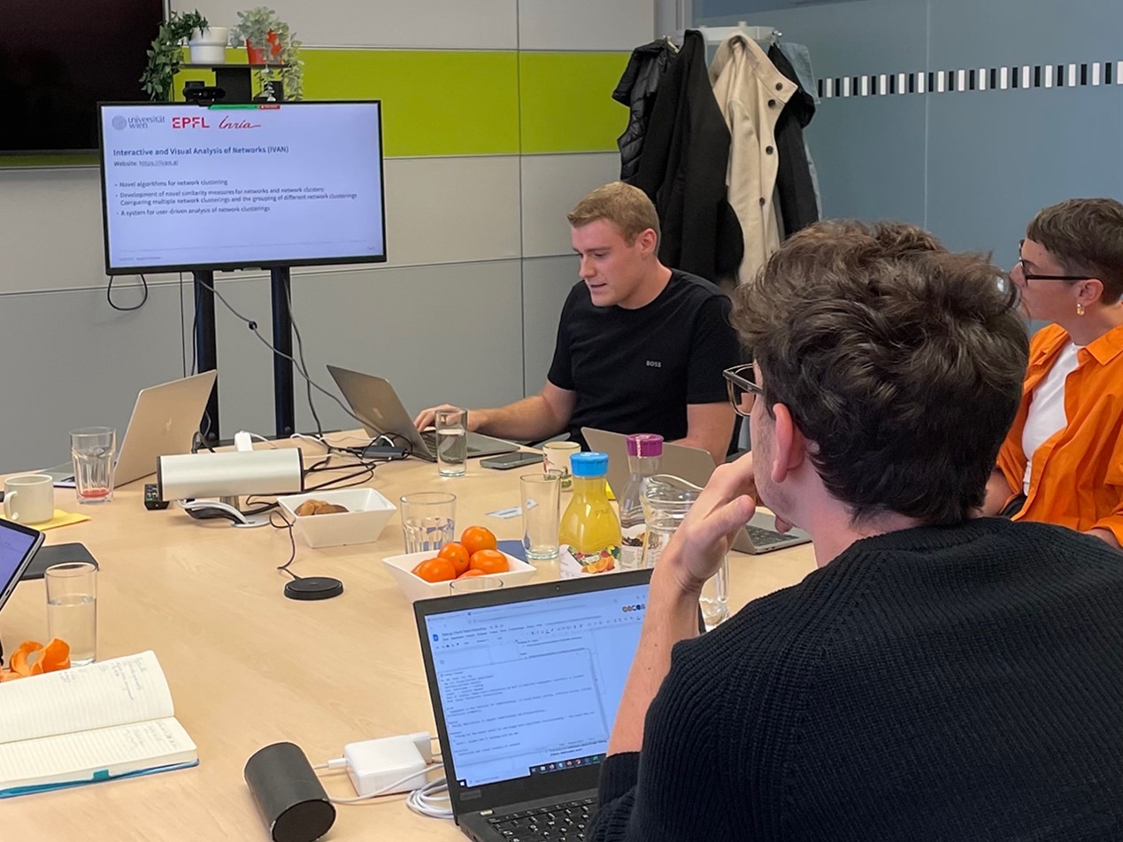
On September 21st we hosted our first Talking Charts Team Workshop with 8 exciting presentations, brainstorming sessions, and discussions about visual data communication.
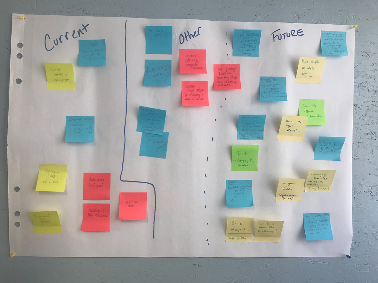
Talking Charts is a mixed methods WWTF-funded project exploring how charts related to climate change and COVID-19 are created and understood by researchers and public audiences. The core team of Talking Charts met with researchers working on related topics* for a half-day workshop to gain insights about each other’s current research activities and to discuss common interests. In the first part of the workshop, the attendees gave a short summary of their current work and how it relates to the project, before brainstorming about future research directions and synergies in the second part. Here, we summarize the key points of the discussion.
Communication with lay people. One common aspect that most of the attendees encountered in their research was the intention of communicating to a broader public as opposed to communicating solely to (domain) experts and scientists, raising questions such as: How do we define a target group of “lay people”, i.e. people without a certain domain experience? What kinds of data visualizations do lay people consume in media and how do they make sense of them? And how can we design data visualizations that fit lay people’s needs? While user-centered design is an established field of study, it is less commonly integrated into visualization design practices − to actively take into account the needs, preferences and ideas of people who are not domain experts.
Attention, emotion, engagement. When it comes to communicating with lay audiences, two factors play an important role: attention and engagement. The emotional engagement and identification of lay people with the presented information can be an indicator of its perceived usefulness, meaning that people tend to perceive information as more relevant that relates to them in a personal way. In this regard, we asked ourselves: What catches people’s attention? How do people engage with types of content, like charts and graphical depictions? And how do empathetic emotions affect attention and understanding? Including empathetic emotions in the presentation of data opens up ways for people to relate to it, although it can also be manipulated. Studying how people engage with and react to (online) content like charts can help us assess the effect of different forms of content or design alternatives and classify types of engagement.
The context of a data visualization. Throughout various discussion topics, the importance of context became apparent. While data itself can be regarded as an abstraction of reality, the choice over how it is visualized and the context in which it is presented shapes how data is perceived by its readers. The same data source is commonly used by a variety of different media and news outlets, be it in print, online or social media channels. This makes “tracing” a data visualization back to its origin and assessing different design choices all the more interesting. However, the context in which a data visualization is published is not only relevant when it comes to comparing design alternatives, but also in regards to how it will reach the reader: In which situations is a person exposed to which data visualizations? Which type of media uses visual or textual elements to get the reader’s attention or foster understanding? And how do attention and interpretation of information change in different contexts?
Similar questions were also relevant in the research Regina Schuster completed, which builds on her Master’s thesis, “‘Being Simple on Complex Issues’ – An Expert View on Visual Data Communication of Climate Change“. This project aimed at investigating how data visualizations can be better utilized to communicate the complexities of climate change to different audiences. In this context, the research team conducted interviews with 17 experts in the fields of climate change, science communication and data visualization, as well as with 6 members of the broader citizenry. The findings were used to derive implications and recommendations for creating more effective visualizations, particularly in news media sources geared toward lay audiences. Implications include the establishment of an iterative, user-centered co-design process, the adaption of contents according to the needs of the audience, and the integration of information and formats which users can relate to. This work further discusses the role of storytelling, aesthetics, uncertainty representation, and interactive techniques in the visual communication of climate change.
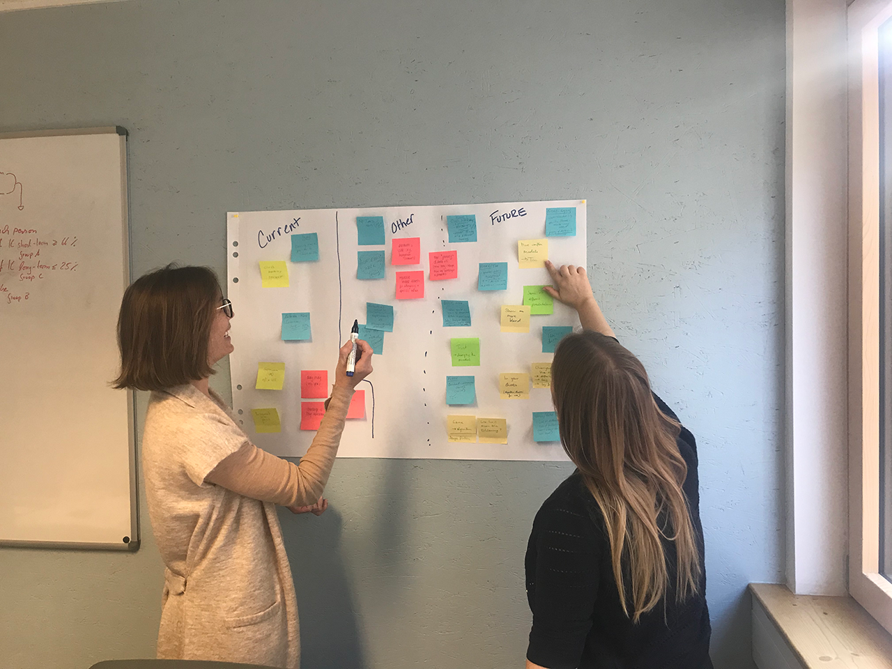
While there are still many open questions, our first Talking Charts workshop helped us to achieve several important goals: looking outside of the box of our own individual research, identifying synergies with similar research projects, and mapping common ground for future projects. We are happy that this event has inspired exciting and fruitful discussions as well as opportunities for collaboration amongst participants, and are looking forward to the next Talking Charts workshop.
Are you working on similar topics and would like to chat? Feel free to reach out! You can also sign up for our mailing list if you would like to be notified about open workshop events and future studies.
* Workshop participants (in alphabetical order): Sarah Davies, Vesna Fulle, Kathleen Gregory, Bernhard Jordan, Christian Knoll, Laura Koesten, Torsten Möller, Verena Prantl, Timothée Schmude, Regina Schuster, Sebastian Tschiatschek
Workshop organisers: Kathleen Gregory, Laura Koesten
Authors: Regina Schuster, Timothée Schmude, Christian Knoll (Research Group Visualization and Data Analysis, VDA)